
8 Challenging Web Design Trends of 2015
Web design is evolving at crazy speed. That’s why web design trends also keep on evolving. And this is the reason we have to learn, relearn and keep on relearning this mix of art and science.
This year’s web design trends seem a little different from previous years. That is because in previous years, our target was only to stay up to date with whatever was cool in the industry. This year, that’s really the case.
This year design is changing but the reason is that users are changing their devices. 2015 is going to be the first year when tablet sale will surpass the sale of personal computers. Meaning this time, we have to relearn our web design keeping mobile devices. The devices that did not exist just a few ago.
This year, the trends are a little more challenging, but this is the right time to take on the challenge. If we learn it now, we will be in a good position to dominate the industry for next couple of years.
In today’s article, we will be discovering what are the trends that will be our engine to take our web design forward. We will also be looking at multiple example websites that are already following those trends.
Mobile First Responsiveness
When the term “responsive” or RWD (responsive web design) was coined, it referred to a website that is displayed in the same manner in all devices. With time, we realized that each user deserves a personalized experience so we must not present the same design from mobile phone user to large screen desktop user.
A year ago we published guesstimates for the year 2014. There I discussed that RWD will evolve. I thought the term “responsive” will not stay but Bootstrap and such other JavaScript frameworks had something else in mind.
Responsive web design has evolved and by definition it is a whole new thing now. The term does not mean that same layout will be shown to all web users, instead that means that each user will get a customized view of the website.
Today, we know it for a fact that more tablets will be sold than desktop computers in 2015. So it is absolutely clear that mobile device users are soon going to become the majority or internet users. Your clients want to capture that market so you would want to design websites that look brilliant especially on mobile devices.
This mobile first approach will be dominating today’s article because this is the biggest news today.
The Responsive Challenge
There is another challenge to responsiveness. Even though we will be designing keeping mobile devices in mind, but we must not forget that mobile phones, tablets and desktop computers are not the only devices that open websites.
These days, we have smart watches, we have smart TVs, fridge, AC and even washing machine… everything is turning smart these days.
Designers have to make websites that look perfect on all those devices. This is a challenge that is likely to rise in 2015 and we have to prepare ourselves to take the bull by its horns.
Flexible Typography
Type is one thing that really confuses designers. Personally, I started my career from desktop publishing but when I make websites, I still sometimes try to congest things out of habit.
The fundamental difference between print and online media is that print media has limited space, while online media has no limits. So it doesn’t matter how much whitespace we put in a web page; if it looks good, it’s alright.
Designers learn one thing in the beginning of their career which is that text readability primarily depends on two things:
- Text Size
- Whitespace
Whitespace should be called blank space in web, since website’s background does not always have to be white.
Now we are seeing more focus on type by web designers. The text size is bigger, easily readable and contains lots of whitespace. This trend is likely to grow stronger in the times to come since mobile users need large, easily readable text. And with retina display devices, text sizes will have to grow even more.
Examples


Ghost Buttons
Ghost became very popular CMS a few months back. These days, Ghost CMS is not around much but a unique style of button that Ghost introduced has become quite popular.
Simply called ghost buttons, they are taking the web by storm. Sitepoint published the story of Ghost buttons. And Codepen has a tutorial for learning to make this button.
Personally, I don’t think this trend will stay around for long. I say this because I think calls-to-action need to be clearly visible, Ghost buttons is not clearly visible. So they may look cool, but they are not that good when it comes to conversion rate.
Nonetheless, Ghost buttons are extremely popular these days.
Examples


Flat Reinforced
Using flat colors is nothing new, but now it is being reinforced. Microsoft has launched its guidelines that suggest you use flat. Google has also launched its material design guidelines, and they also advise us to use flat colors everywhere in web designs. Even Apple’s iOS interface design guidelines recommend designers to use flat colors.
When Microsoft, Apple and Google make a unanimous opinion, that’s not their opinion, that’s the opinion of God. We cannot go against it. We will be designing flat this year, and many years to come.
Examples


Tiles / Card Based Designs
With the rise of mobile friendly web designs, the strongest trend that has really made itself successful is card based design. It is also called tile based design owing to its resemblance with Windows 8 start screen.
Such web designs are very easy to tap on and navigate for mobile users. Besides they can stack up loads of content in a neat fashion and they look refreshingly new.
So all in all, card based designs are popular and they are likely to grow in popularity.
Examples
Dvotion

Fasett

Music Festival

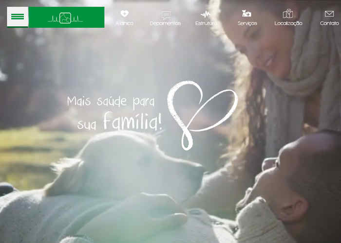
Large Images
Large images look gorgeous on small screens, such as mobile phones and tablets. That’s the reason full screen websites are quite popular these days.
But you should take caution because your website needs to look good even when it’s loading and image has not loaded yet. The image also needs to be optimized so it would load quickly and does not negatively affect UX or SEO.
Examples


Mobile Friendly UI
Video over Text: Nobody likes to read boring web content. People would rather listen to it. That’s why people are turning to more and more to use videos instead of text. A video is more engaging, quick and it delivers conversion rates. So use videos.
Large Buttons: Not only buttons, but icons, images, text and everything else needs to be easily readable and tap-able.
More Scrolling, Less Clicking: Mobile users really hate navigating through pages. It’s obvious isn’t it, scrolling is easier while navigating through pages means the user has to zoom in, tap it and adjust zoom once again. Not cool!
Conclusion
The basic idea this year is to make websites that suit mobile device users. That includes mobile phones and tablets. So we would use large text, large buttons, card based designs, less text, more videos and we would make the website scroll friendly.
All in all, a better user experience to mobile users is the key to success in 2015.